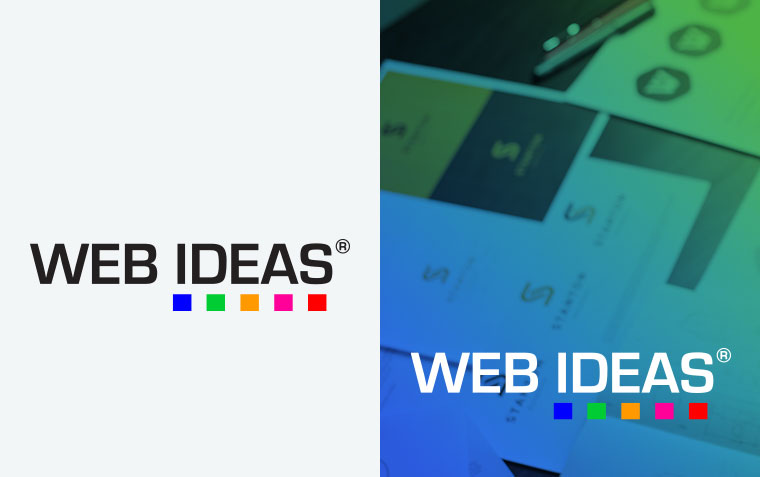
What logo variations does my business need?

The goal of a logo is to create strong brand recognition so that people recognise your business quickly in whatever environment they encounter it. With well thought-out design you can leverage different versions of your logo to better suit all locations it will appear.
Where will you need different logos
Your logo can appear in many places including online:
- Your social media
- Your website
- Online directories
Or in physical locations:
- Business cards
- Brochures
- Flyers
- Signage
- Vehicle wraps
- Staff uniforms
Sometimes your logo will appear next to other logos, such as in directories or as an affiliation or sponsor. When this happens, you want your logo to be comparable in size to those around it, so it doesn’t end up looking small and out of place or dominating all those around it.
What variations should you have
There are some standard variations that you should consider creating for use in different locations and can be separated into two types: orientation; and colour.
Orientation:
The orientation of your logo works to best fit the space it is given.
Landscape – A version that is shorter in height but has length. Elements within a landscape logo tend to be next to each other and it allows for the text to be the focus. This is perfect for websites where you can place it in the header and not have it take it too much height of the screen or be too small to read.
Stacked – A version that is taller than its landscape counterpart. It takes on more of a square or portrait orientation and places elements from the logo “stacked” on top of one another. You can use this version to give more presence to a graphic element within your logo. This is perfect for use on social media where the standard profile pictures are squares and circles.
Colour:
Full-Colour – This version of your logo has as many colours and effects, like gradients, that you want. This is usually the main version you will use or will be created first by your brand designer.
Mono-chromatic – There are some times where your logo will be limited to a single, flat colour in your main branded colour. You want to remove any effects, including gradients, and make use of negative space to highlight any shapes in other colours overlaying each other.
Black & White – This combines the mono-chromatic version with black, white, and grey options. These are likely to be used when the background has a lot of colour and you want maximum contrast for readability.
***
Having a well-designed logo with versatile variations is crucial for maintaining strong brand recognition across all platforms. By creating different orientations and colour variations, you can ensure that your logo is always presented in the best possible way, whether it's on social media, your website, business cards, or even staff uniforms. These thoughtful adaptations help your brand remain consistent, professional, and visually appealing, no matter where your logo appears. Invest in developing these variations to enhance your brand's visibility and impact, ensuring it stands out and is easily recognizable in any environment.


