Updated and refreshed website for HotShot Winners
www.hotshotwinners.com.au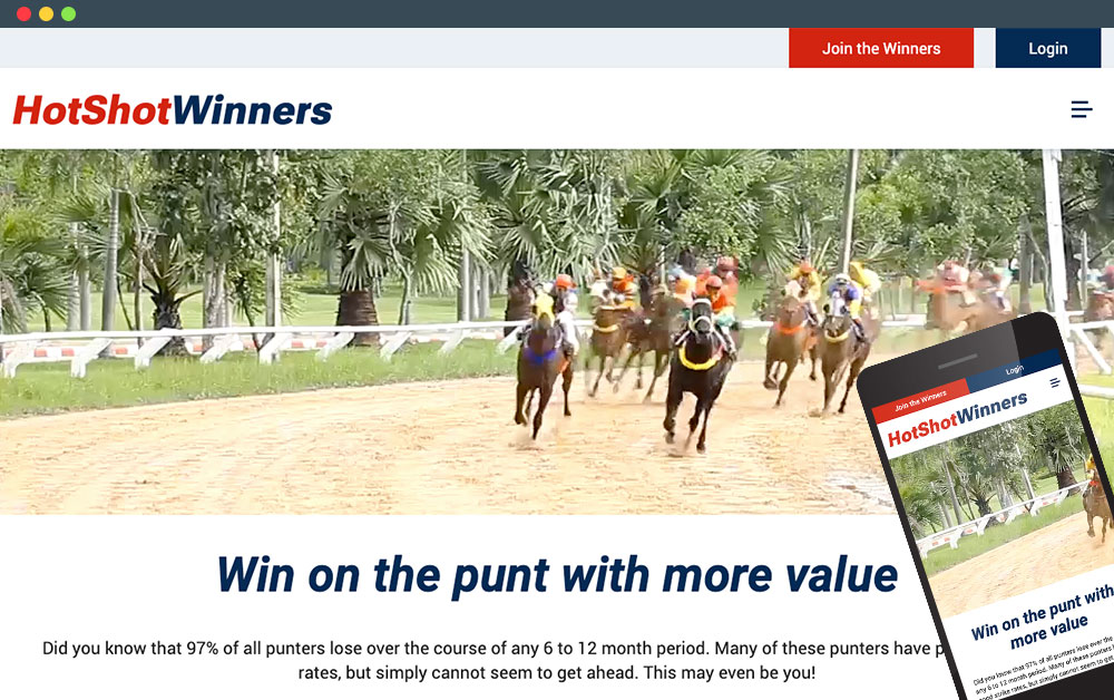
HotShot Winners came to us wanting to give their tired looking website a design refresh, as well as equip their website with an easy to use member system for their punters.
We worked with them to create a website with:
1. Fresh, Modern Design: Our website now sports a modern and visually appealing design. The new look is not only eye-catching but also user-friendly, making it easier for you to navigate and find the information you need.
2. Enhanced Functionality: We've revamped our website's functionality to ensure a smoother and more intuitive user experience. Whether you're signing up for tips, reading our punting articles, or contacting us, you'll find everything to be more streamlined and user-centric.
3. Mobile-Friendly: Our new design is fully responsive, which means you can access our website easily from your smartphone or tablet without any compromise in usability or design quality.
4. Improved Content: We've updated our content to provide you with the latest information, insights, and resources you need. Whether you're looking for results, signing up for tips, or company news, you'll find it all up-to-date.
5. Faster Loading Times: We've optimised our website for speed, so pages load faster than ever, ensuring you spend less time waiting and more time exploring.
Web Ideas developed their membership system into something easy to use for both the adminstrator of the site and their members.

