
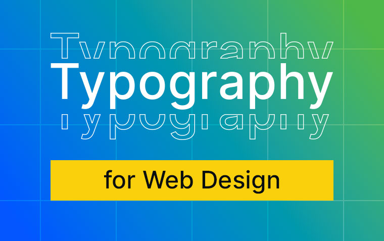
The Role of Typography in Web Design: Best Practices and Tips
Typography is a fundamental element of web design that significantly impacts the user experience, readability, and overall look and feel of a website. Choosing the right fonts and arranging them effectively can make a website more engaging and user-friendly. In this post, we’ll explore the role of typography in custom website design as well as offer best practices and tips to help you.
What is Typography
Typography is the word used to describe the overarching idea of how words are laid out on a page. This includes things like what font is used, the sizing of the words, if the text is thin or bold, as well as the spacing between it all.
Why Typography Matters
First Impressions:
Typography sets the tone for your website. The choice of fonts, their sizes, and the way they are displayed can convey professionalism, creativity, or fun, influencing visitors' perceptions within seconds. What does a sans-serif font (a font without the caps and feet) make you think of vs a handwritten or more decorative font?
Readability:
Clear and legible typography ensures that users can easily read and understand the content. If users can’t read what your site is saying because of poor typography, this can lead to frustration and higher bounce rates.
Hierarchy and Structure:
Effective typography creates a visual hierarchy, guiding users through the content. It highlights the most important elements and organises information in a way that’s easy to follow. This increases the readability of the content and makes it easier for users to quickly scan and understand what your site is about, and which content is important.
Brand Identity:
Typography is a key component of brand identity, and you want to carry this through on your website. Consistent use of fonts that align with your brand’s personality reinforces brand recognition and trust.
Best Practices for Web Typography
Choose Readable Fonts:
Select fonts that are easy to read on various devices and screen sizes. Sans-serif fonts like Open Sans, Roboto, and Inter are popular choices for body text due to their clarity.
Limit Font Families:
Stick to two or three font families to maintain a cohesive and uncluttered look. Use one for headings and another for body text, and perhaps a third for special elements. You can even use a single font family and use weight, size, and colour to provide hierarchy with the headings.
Establish a Hierarchy:
Use different font sizes, weights, and styles to create a clear hierarchy. Headings should stand out from body text and should have different levels to them. An example of this can be seen in this blog post where the main heading is at the top, each section has a different heading, and each point has a different heading again.
Optimise Line Length and Spacing:
Aim for a line length of 50-75 characters for optimal readability. Adjust line height (leading) and letter spacing (tracking) to ensure text is not too cramped or too spaced out. You also can’t predict the size of the screen that someone will access your website on so you want to set a maximum width the content will go to.
Use Responsive Typography:
Ensure your typography scales well on different devices. Use relative units like rem or percentages instead of fixed pixel sizes to make your text resizes appropriately to different screens and devices.
Contrast and Colour:
Ensure there is enough contrast between text and background colours. High contrast improves readability, especially for users with visual impairments. Colours need to meet a minimum contrast ratio of 4.5:1 for body text with the aim being a contrast ratio of 7:1 to meet higher accessibility standards. You can use WebAIM’s contrast checker to see how your text holds up.
Test Across Devices:
Test your typography on various devices and browsers to ensure consistency and readability. Pay attention to how different fonts render and adjust as needed.
Tips for Effective Typography
Web Safe Fonts and Custom Fonts:
Gone are the days of using a limited list of Web Safe fonts that were installed on every computer. Using a service like Google Fonts allows for more options and control of how your site looks.
Font Pairing:
Pair fonts that complement each other and aren’t too similar. A common approach is to pair a serif font with a sans-serif font to create a nice contrast that can also assist in setting the hierarchy.
Whitespace:
Don’t underestimate the power of whitespace. Giving space around your text makes it easier to quickly scan and can make the overall site look clean and fresh.
Accessibility:
Consider accessibility guidelines when choosing typography. The World Wide Web Consortium (W3C) have produced the Web Content Accessibility Guidelines (WCAG), which are accepted as the international standard. They aim to make the web an accessible place for everyone, and you can follow their guidelines for font size and colour to increase the accessibility of your site.
Consistency:
Maintain consistency in typography throughout your website. Your CMS will likely have set styles for paragraph text, headings, and links for you to use, ensuring that everything is consistent.
Typography plays a crucial role in web design, affecting how users perceive and interact with your website. By following best practices and implementing thoughtful typography choices, you can enhance the user experience, improve readability, and reinforce your brand identity. Remember, good typography is not just about choosing beautiful fonts; it’s about creating a seamless and enjoyable reading experience for your users.
Incorporate these practices and tips into your website design to create a visually appealing and highly functional website, or contact us to build your new website following these best practices and tips.
Related News & Information

The Power of Custom Website Integration
A website is a pivotal tool in your operational toolkit. Custom website integration is the key to unlocking an interconnected system tailored specifically to your business’ needs.
Mastering Layout for Print vs. Web
Understanding the differences between print and web design is crucial for any designer aiming to create compelling and effective visuals in both realms.