Modern Update of Water's Edge Consulting Website
www.waters-edge.com.au
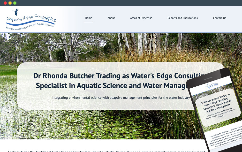
The redesign of the Waters Edge Consulting website was driven by the need to revitalise its online presence, as the previous design had become outdated and lacklustre.
The main objective was to breathe new life into the site with a fresh, modern design that reflects the professionalism and expertise of the consultancy, particularly in its work with diverse waterways.
By incorporating customer-supplied images of the water environments the consultancy has worked on, the redesign aimed to visually communicate the direct impact and scope of their services. This approach was paired with an updated, cleaner layout that enhances user experience and engagement, making the site both more appealing and functional.
In revitalising the Waters Edge Consulting website, special attention was given to optimising the layout for enhanced usability and interaction. The new design integrates dynamic elements and transitions that guide visitors through the consultancy’s projects and achievements with ease.
Utilising the striking images provided by the client, the website now showcases beautiful, real-world examples of waterways transformed by the consultancy's work. These images not only serve as compelling evidence of their capabilities but also create an emotional connection with site visitors, helping to establish credibility.


